Design Smarter Caps: How to Make Your Cap Wear You Well (And Not Just Look Good in a Mockup)
If you think designing a cap is just slapping on a phrase and hitting “Buy,” let’s talk. Because most custom caps out there look… bad. Too big, too small, off-center, ugly color combos — you’ve seen them. Maybe you’ve worn them (we won’t judge).
The difference between a cap you love and one that collects dust in a drawer comes down to design choices — not Photoshop skills, but knowing how caps really work on a human head. A cap is not a billboard. It’s not a business card. It’s part of your face. And embroidery? It has its own rules. If you ignore them, your design might look great on screen but terrible in thread.
Here’s how to design a RUDECAP that looks badass both online and IRL.
Stop Filling the Print Area Like You’re Making a Poster

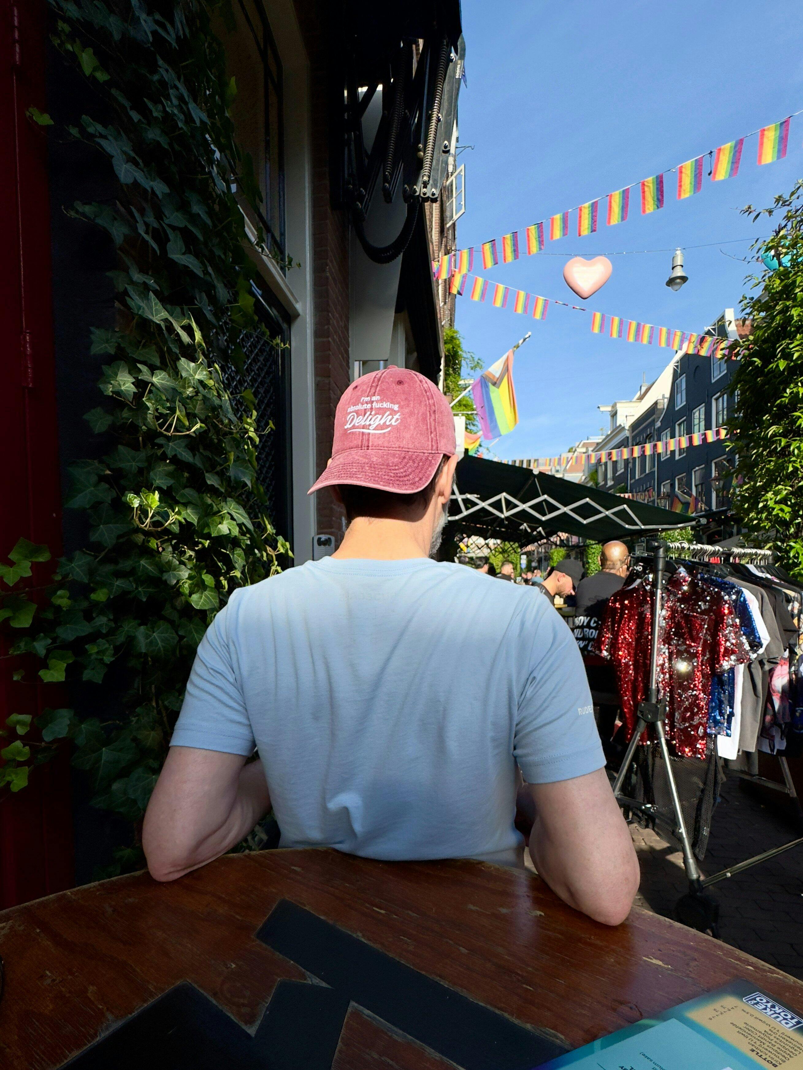
Here’s a hot truth: the bigger your letters, the smaller your head looks. Oversized embroidery fills the cap and drains your face of proportion. It draws the eye away from you. The mockup might say "go big," but reality says otherwise.
Smaller, more focused designs add interest and leave breathing room around your face. Think of your design like a killer necklace or pair of sunglasses — it should complement, not compete with, your head.
Embroidery Isn’t Magic — It’s Thread
Embroidery can't do everything ink can. There are real, physical limits. Clean and bold always wins:
- Solid shapes, solid colors
- No gradients or distressed effects
- No photos or busy backgrounds
Threads can’t blend. What looks like a smoky fade in Photoshop becomes a lumpy mess in real life. Stick to bold icons and punchy phrases. Less detail = more impact.
Size Matters (A Lot)
- Minimum text height: 0.25” (6.35 mm)
- Line thickness: At least 0.05” (1.27 mm)
- Shape thickness: Between 0.05” and 0.5”
Tiny details get swallowed by thread. Thin lines snap, and small fonts get rejected or stitched into oblivion. Keep it big, clean, and legible.
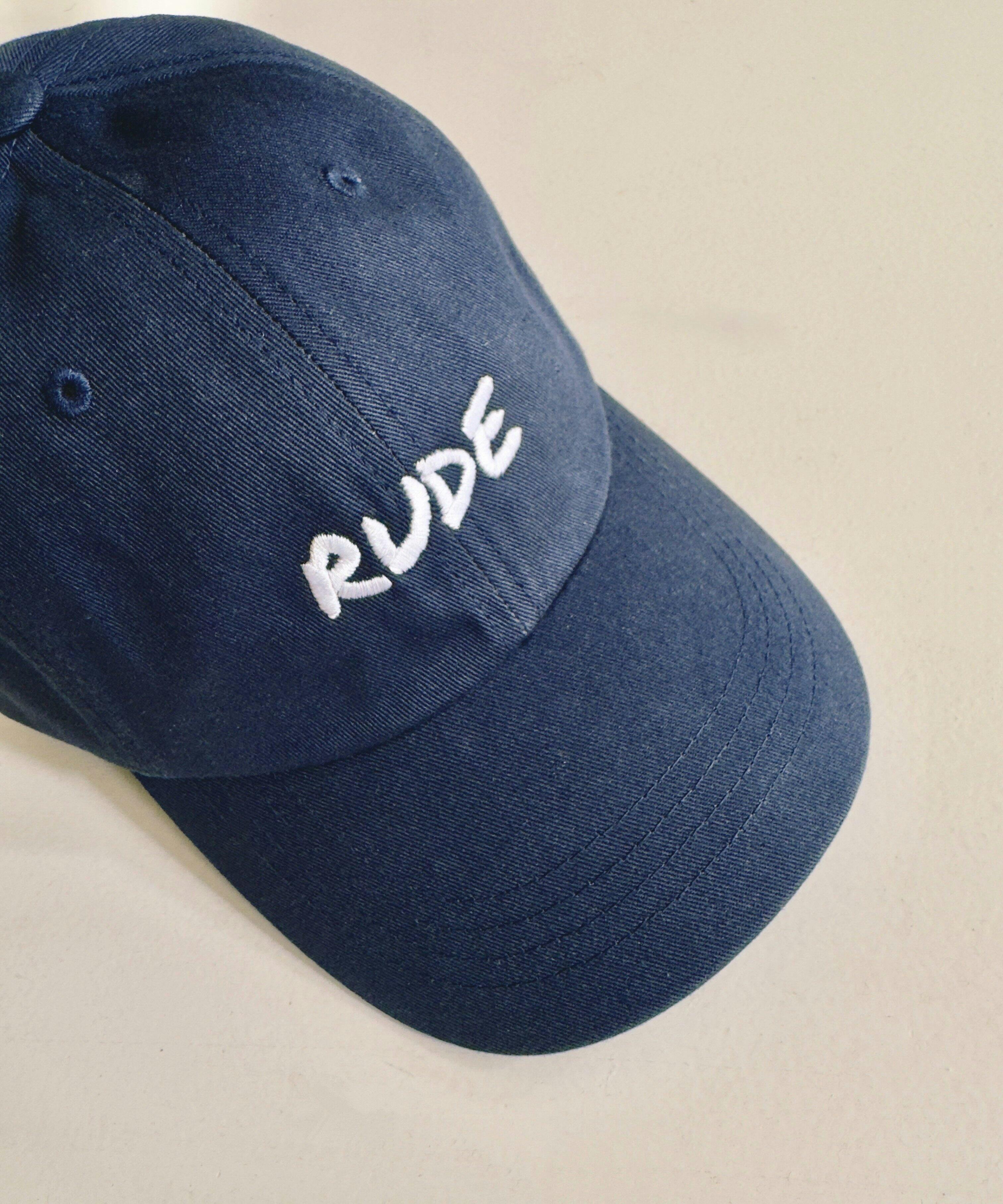
Your Cap Is Read in 1 Second — Use Fonts That Hit Fast

Nobody studies your cap like an eye chart. It’s seen in motion. So forget curly scripts, ultra-thin lines, or novelty fonts.
Straightforward fonts make the most impact. Don’t waste time browsing for something "unique." Fonts like Impact, Anton, or Bebas Neue punch through fast and fit more text thanks to their narrow build.
BIG, CHUNKY, LEGIBLE TYPE WORKS. STRONG ICONS WORK. CLEVER SPACING WORKS.
Treat your design like a headline. Not a paragraph.
Color Isn’t Just About Contrast — It’s About You

Yes, contrast helps visibility. But great designers think deeper. What works with your skin tone? Your outfit? Your vibe?
- High contrast = bold and attention-grabbing
- Complementary tones = cohesive, wearable
- Tone-on-tone = understated and premium
Avoid muddy combos like medium grey on blue. And remember, you’ve only got 15 thread colors to choose from. Stick with solid, high-impact colors that actually work in thread.
Ditch the Background (Really)
Backgrounds don’t embroider. Upload files with transparent backgrounds, or manually set the background to "no color" in our design module. If you leave a backdrop it will throw off your whole design.
Negative Space: Friend or Foe
Tiny gaps? Not your friend. Negative space gets filled in during digitization. If your design relies on intricate cutouts or fine spacing, simplify or rethink it. Clean silhouettes always translate better.
Alignment: Centered Isn’t Always Smarter

Centered can look formal or safe — and sometimes that works. But off-center, left-aligned, or floating placement can feel sharper, cheekier, or more modern. Caps sit on curves and angles. Your design doesn’t always have to obey the grid.
A small word near the temple? Cool. An icon floating high? Quietly rebellious. Play with position. Let it fit the mood.
Think of It as Styling, Not Printing

Design your cap the way you pick an outfit. Does it flatter your look? Does it overpower your face? Would you wear it with your best clothes, or does it feel like merch from an event you didn’t go to?
If it doesn’t feel like you, simplify it. Scale it back. Choose colors that work with your wardrobe and fonts that don’t fight for attention. The goal isn’t to show off your design software skills. It’s to create something you’ll actually wear.
Final Pro Tips
- Use high-res files: 300 DPI, at least 1200×675 pixels
- Avoid photos, gradients, textures, or tiny elements
- Order a sample before going live
- Less is more: The cleaner the design, the better the stitch
TL;DR
Design smaller. Think sharper. Use fonts that shout clearly. Choose colors that work with your life. And for the love of embroidery, stop designing like your cap is a billboard. It’s not. It’s your face’s favorite accessory.
Want to make sure your design is embroidery-proof? Send it in. We'd rather check it before you end up wearing regret.